Articles
| Name | Author |
|---|
Case Study: Accurate measurements mean better aircraft performance management at Norwegian
Author: Nurdan Pakdil, Performance Engineer at Norwegian
SubscribeNurdan Pakdil, Performance Engineer at Norwegian Flight Support shares how Norwegian Air uses a digital APM solution to reduce fuel use through better fleet management.
The core of this case study is aircraft performance monitoring (APM), why it is essential, how it enables airlines to save fuel and how we use our APM solution at Norwegian Air. But before we go into that, I’ll briefly introduce to you Norwegian Air, the subject of this case study.
NORWEGIAN AIR
Launched in 1992 and based in Oslo, Norwegian has a modern and fuel-efficient fleet of 70 Boeing 737-NG and -MAX types with plans to further grow the fleet. The business employs 3,500 people across the Headquarters at Fornebu in Norway as well as at support offices in Barcelona and Riga and nine crew bases, four of which are in Norway.
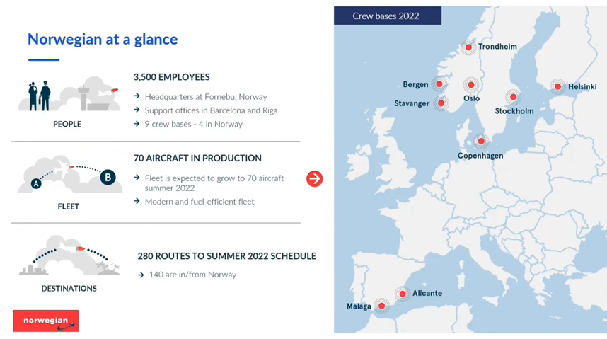
In the summer of 2022, we operated on 280 routes, 140 of which were in Norway.
APM PROCESS AT NORWEGIAN
In figure 2, you’ll see an overview of the APM workflow in Norwegian.
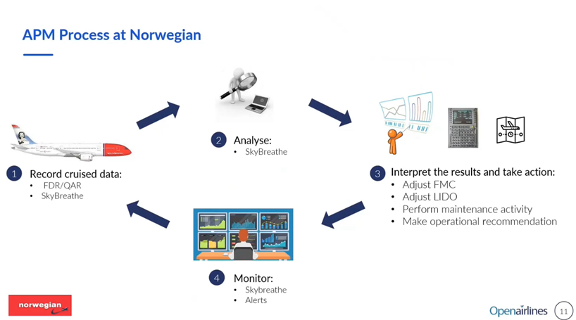
The process starts with collecting cruise data through the QAR before the data is then transferred into SkyBreathe® from OpenAirlines. This is a fully automated process which saves Norwegian from having to undertake any manual workload. In the next step, SkyBreathe® analyses the data and makes it available for the airline to make their assessments as well as further analyses. At Norwegian, the procedure is to perform monthly reviews in the APM system. In those reviews, we are able to identify the aircraft that require a fuel factor update in either the FMC or in the Flight Planning System (LIDO) and make those updates accordingly. Each month, we download the latest fleet list through SkyBreathe® APM to identify the best and worst performing aircraft. That list is shared with the planning team to be taken into account when they do tail assignments.
Apart from these regular monthly reviews, the APM system allows us to continually monitor performance degradations even when we are not logged into the system and actively monitoring. This is made possible with the alerting feature through which, if there are any fast or abnormal degradations detected outside of the monthly review period, the system automatically alerts users who can then go into the system and investigate that specific case. The process repeats with the same steps when the aircraft are in flight and new cruise data is being collected.
BENEFITS FROM APM
There are many advantages to using the APM system, the most important of which is accurate flight planning (figure 3).
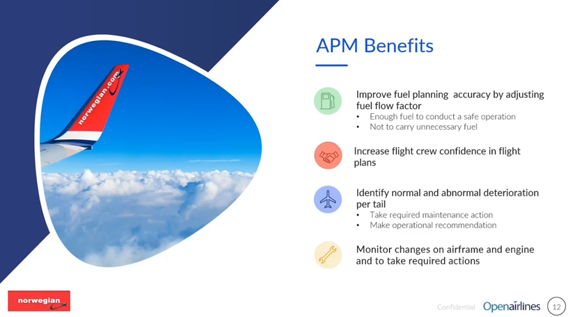
Planned fuel must, of course, meet the regulatory criteria and must be sufficient to conduct a safe operation but, at the same time, it shouldn’t be more than what is necessary because that extra weight would create extra costs for Norwegian. With the APM system, the fuel factor can be adjusted for each aircraft in the flight planning system so that the planned fuel will be as accurate as possible. By having accurate flight plans, the flight crew will have more confidence in those plans so that they won’t feel that it’s necessary to upload extra fuel to compensate for performance degradation across the fleet.
Also, with APM, Norwegian is able to distinguish between normal and abnormal deterioration, and to take the necessary maintenance actions or make operational recommendations. For instance, we can monitor engine cleaning activities, their impact on engine performance and, from that, make recommendations on frequency for cleaning. Lastly, we are able to separately monitor the changes on airframes and engines as prompts for any action that might be needed. As an example, if we observed that the airframe deterioration is due to misfitted ailerons, that observation can be passed to the engineering department to plan for a check on the aircraft in order to take corrective actions. These are all benefits that we have noticed at Norwegian resulting from the APM system.
Measurements are so important. Grace Hopper, an American computer scientist and US Navy officer, also known as the mother of computer science, said that, “One accurate measurement is worth a thousand expert opinions.”
USING SKYBREATHE® APM AT NORWEGIAN
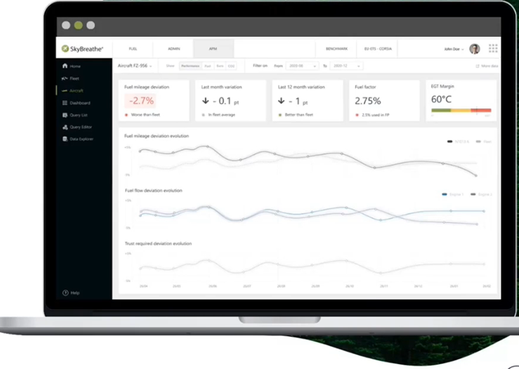
Having explained benefits that Norwegian gains for using the APM (figure 4.1), I’ll try now to walk you through how we use it. Starting with the Home Page (figure 4.2) of SkyBreathe® APM.
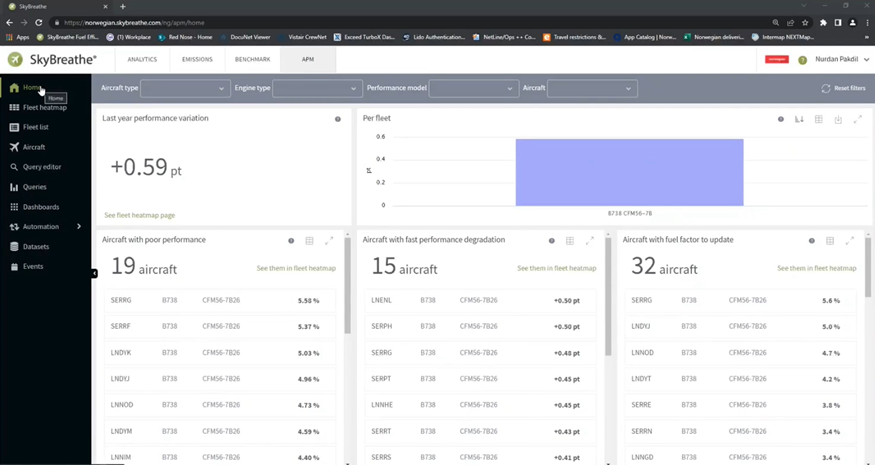
Figure 4.2
This home page provides a quick overview of the current status of our fleet. At the top there is the variation of performance deviation between today and last year so we can observe that we have a degradation of 0.6 percentage points and, below that, we have some lists that show specific cases such as the aircraft with poor performance: we have the aircraft with fast performance degradation (center column) and, on the right, are aircraft which will need their fuel factor to be updated which mean that these aircraft will require an update in the flight planning system. For me, as a performance engineer, this is a good overview plus, we have the fleet heatmap (figure 4.3) which is also very useful for us.
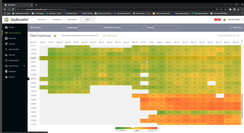
On the heatmap, we can see each tail and their evolution throughout the year, by color coding, as well as distinguish between the better and the worse performing aircraft, also by color coding. You’ll notice that there are some empty boxes and that means that for the month in question, there was no data with which to make the calculations because of the pandemic. We had to ground most of the fleet so no calculations were made. The same can happen when an aircraft is in for maintenance.
If an aircraft is seen to have deteriorating performance, we can simply click on the aircraft that we would like to investigate and that will take us to the aircraft page (figure 4.4) for the specific tail.

On that page, we can see the detailed information about this aircraft’s performance. For example, the aircraft in the figure has a current performance deviation of 5.37% which is worse than the fleet average. We can also see in the ‘Recommended fuel factor’ box that the flight planning system is up to date so, if we are to perform the monthly review today, this aircraft won’t be requiring an update. Below those numbers, there are three graphs. The first one shows the overall performance deviation evolution for the period of time selected – in this case, twelve months – we can see how it evolved and the breakdowns of engine performance and airframe performance for the aircraft. On the second graph, we can see that there has been an engine change carried out for this aircraft and the dates when that was done and this is the reason why the engine performance has degraded. This is the whole point of having a monitoring system so that we can understand the reasons for engine performance degradation which, in this case, in understandable and normal deterioration.
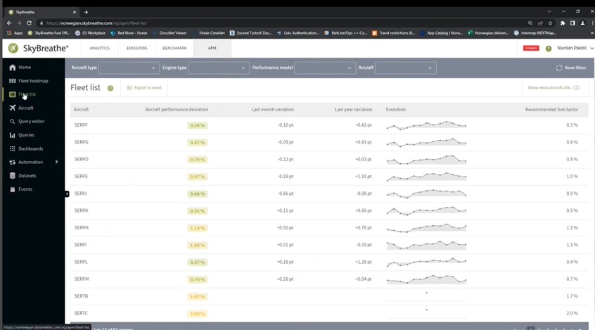
There is another handy function with the Fleet list (figure 4.5.1) where we can get a list of the whole fleet with their current performance degradations.
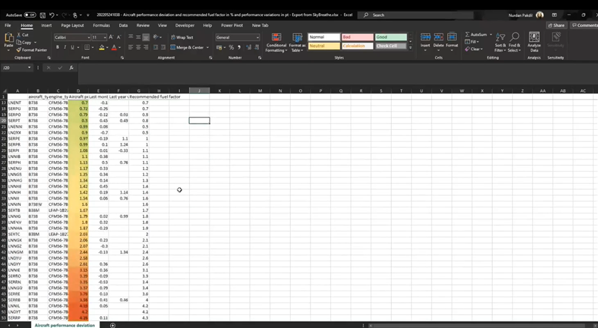
In some cases, from time to time, when we need to get an overview of the fleet, and to share that information with colleagues who don’t have access to SkyBreathe®, this list can be quickly exported to Excel (figure 4.5.2)
Most of the time, people are interested in a comparison of tails to see which one is performing better and which is worse. We can add color coding, similar to what is used in the fleet heat map, and sort the table from better performing to worse, there is now an overview of the aircraft in the fleet. If we look at the best performing ones, the fuel factor required is almost zero which means that they are quite new and are not over-burning compared to the baseline values. If we then check the worst performing aircraft the performance degradation will be more than 5.5% which means that the aircraft in question will be consuming that much more than the best performing tail.
Without an APM system in place, if, say, the fuel factors are not adjusted at all, what happens in real operations is that, if one of the flight crews flies with the worst tail, they will eventually experience an over burning compared to flight plans and then starting from the next flight, will take-on extra fuel to compensate for this. By doing that they will over-compensate for almost half of the fleet. So, if you consider the whole operation, this will add up to a huge quantity of extra and unnecessary fuel. The understanding created by the APM and related data available has enabled Norwegian to avoid crew taking on unnecessary fuel because, as mentioned earlier, the APM increases flight crews’ confidence. The airline lets them know that the cruise performance of aircraft is being closely monitored and that fuel factors are being adjusted accordingly so that crew don’t have to upload extra fuel just to compensate for degraded performances.
Using the system, Norwegian has developed many pre-defined queries that help to analyze certain conditions and we are also able to customize those and create our own queries based on specific operational needs (figure 4.6).
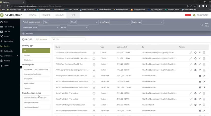
Figure 4.6.1
With the results of the query, we can quickly run an analysis depending on what outcome is needed. So, let’s say that we want to be able to see the performance deviation of the fleet plus the recommended fuel factor for each aircraft plus the current flight plan fuel factor. The results can be grouped by aircraft and we can select how often we want the report produced (say monthly). We can also include some filtering. For instance, as already mentioned, there was a time frame during the pandemic when there were no operations so we would exclude that from the analysis. The final outcome is the result of the analysis (figure 4.6.2).
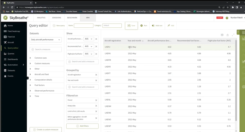
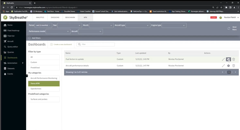
The screen is by registration and the date is also noted as well as the latest calculated performance deviation and what is in the flight plan. It’s then possible to save the query for future use plus to add it to the individual user’s dashboard (figure 4.6.3) where it will be available at all times without the need to re-run or adjust the queries.
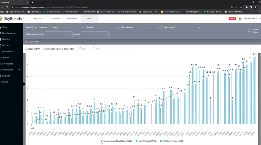
With the dashboards and fuel factor updates we can do the monthly reviews; we can check the status using two different tables for performing updates in the Flight Planning System (Lido for Norwegian) and the FMC. The reason for having two different tables is that we use different tolerance limits with the flight planning system being more precise than the FMC; also, the FMC updates take longer to perform and are the primary means for fuel planning and fuel uplifts based on Lido flight planning. From the two tables, we can see the differences between the current Lido fuel factor and the recommended one, and, if it’s above a certain threshold, it will come up in this list.
Right below there is a visual (figure 4.6.4) where we can see how well we have done or how close the flight planning fuel factor was to the recommended fuel factor.
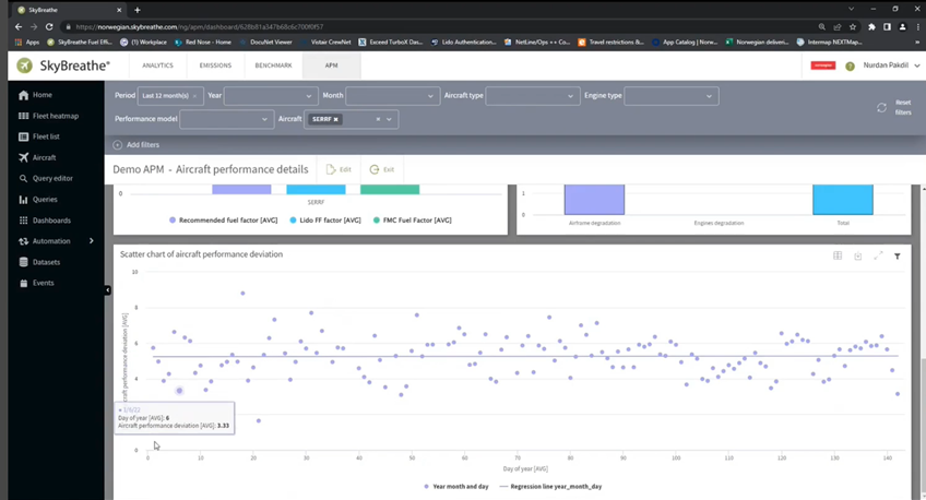
Then, if we go back to the dashboard, we also have some other performance metrics that can be monitored by selecting an aircraft so that the chart in figure 5 shows the relationship between EGT and N1 with the bar charts under the graph showing the recommended fuel factor (purple) together with Lido (blue) and FMC (green).
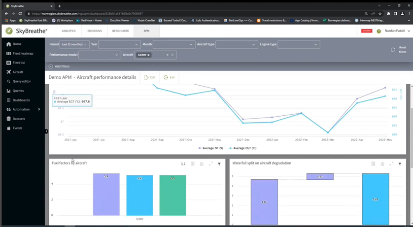
The chart on the right is interesting showing the total degradation of performance (blue) with how much of that is caused by the airframe degradation and how much by engine degradation (the two purple columns). Mostly if, as in this example, most degradation is related to the airframe, the problem will be weight inaccuracies.
Further down the screen still, there is a scatter chart (figure 5.2) with daily performances and the regression line.
One other handy feature is the automation tab which has report and alert functions. In Reports we can set a schedule for, say, queries to be run at specific intervals – each month if reviews are monthly; there is no need to set up the queries manually each time. It’s also possible to configure the email to which the report will be attached and to adjust the content of the message. The report will be sent to users as an attachment to the email.
The alerting function is also handy. It only raises alerts where the conditions in the queries that we have defined are met. Where the query has been created to identify fast performance deviations, it will run every day and will raise an alert if the day’s performance is more than 0.25% different from before. The system will then enable users to understand why the deviation has happened.
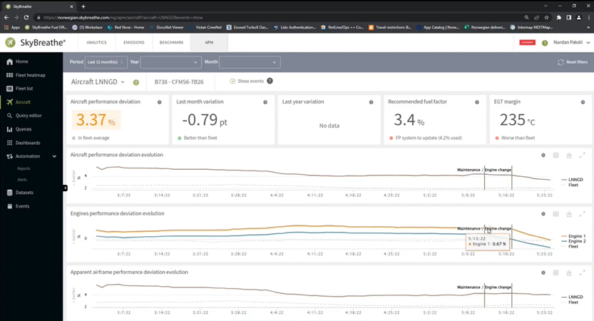
If we look at the engine details in figure 5.3, we can see that an engine has been changed for a better performing engine so that we can clearly understand why it has a fast deviation. This is the whole point of having an ASPM system; the airline is in control of the cruise performance data of the aircraft and they need to be aware of changes and how they impact.
I hope that readers will find this useful information for them when considering their aircraft performance management software. We have certainly found it to be a boon at Norwegian.
How Norwegian leverages artificial intelligence to optimize aircraft performance monitoring across their fleet and how they manage the APM process and use their APM tool.
Contributor’s Details
Nurdan Pakdil

Lorem ipsum dolor sit amet, consectetur adipiscing elit, sed do eiusmod tempor incididunt ut labore et dolore magna aliqua. Ut enim ad minim veniam, quis nostrud exercitation ullamco laboris nisi ut aliquip ex ea commodo consequat. Duis aute irure dolor in reprehenderit in voluptate velit esse cillum dolore eu fugiat nulla pariatur. Excepteur sint occaecat cupidatat non proident, sunt in culpa qui officia deserunt mollit anim id est laborum
Norwegian Air

Norwegian has a modern and fuel-efficient fleet of 70 Boeing 737-NG and -MAX types with plans to further grow the fleet. The business employs 3,500 people across the Headquarters at Fornebu in Norway as well as at support offices in Barcelona and Riga and nine crew bases, four of which are in Norway.
OpenAirlines

OpenAirlines is an innovative consulting and software company with a special focus on Fuel savings and the Environment, Aircraft Performance Monitoring and EFB solutions. The mission is to help airlines save 2-5% of their fuel consumption and reduce CO2 emissions with the SkyBreathe® 360° eco-flying platform, used by more than 50 airlines all over the world. In November 2021, OpenAirlines launched SkyBreathe® APM, a revolutionary aircraft performance monitoring solution to maximize fuel savings.
Comments (0)
There are currently no comments about this article.
To post a comment, please login or subscribe.